


The Transformative Power of Graphics
When I create a graphic with a group, I am often surprised by the reaction it gets: how it has meaning and significance way beyond the few coloured lines I have drawn. I am sometimes quite critical of my drawings and in awe of others who can create much more stunning illustrations.
However, it isn’t really about that. It’s about the connection between the individual or group and the graphic. It’s their words, their ideas and their images. Does it matter that my horse is a little short and stumpy looking? No, it doesn’t. What matters is that when that person described themselves galloping across the sand at sunset, I listened and I recorded it. I used their words. I didn’t censor or sanitise. I asked questions to gather more details from them. I drew them on that horse and I fed back to them what I had heard.
It’s the connection that’s the important thing. It’s that connection that makes the graphic so compelling. And it’s why, years later, I find that people still have their graphics. I see them still on the walls of organisations where I facilitated team days. Individuals I have facilitated planning with tell me that they still have their MAP or PATH, tied up with the ribbon I gave them many years ago. They tell me how they used is as a touchstone, giving them strength and resolve and keeping them committed to achieving their dreams. The graphic evokes the memory of the process that was powerful and transformative.
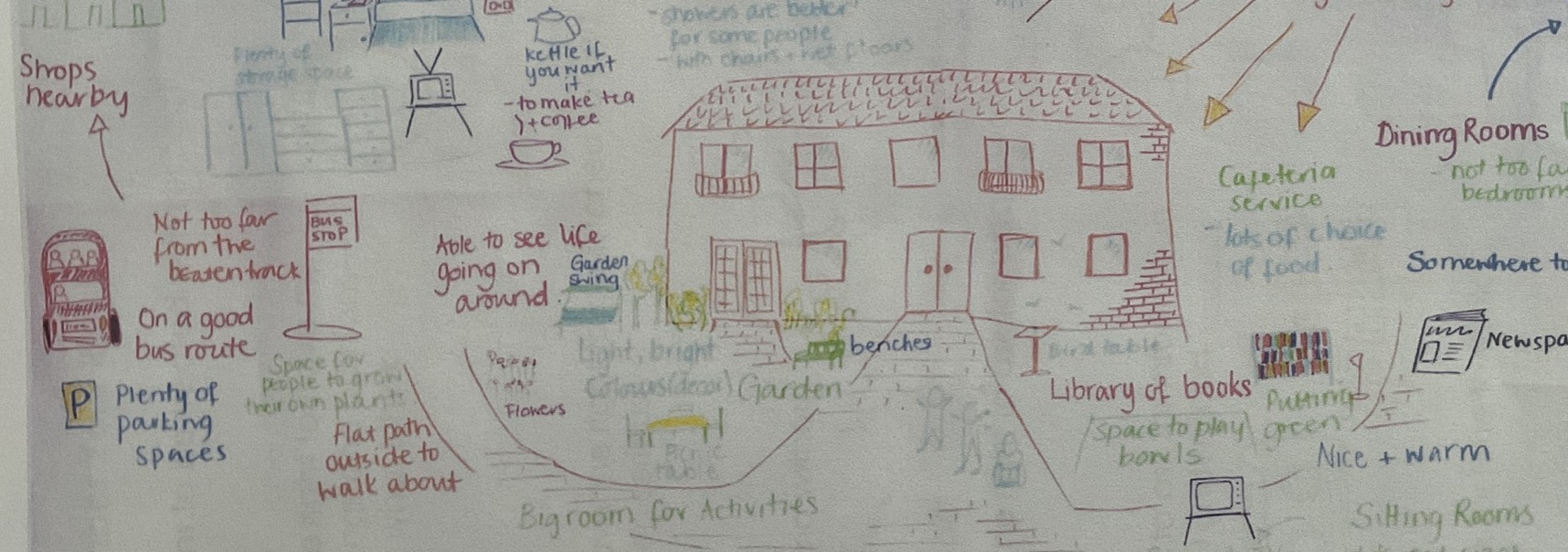
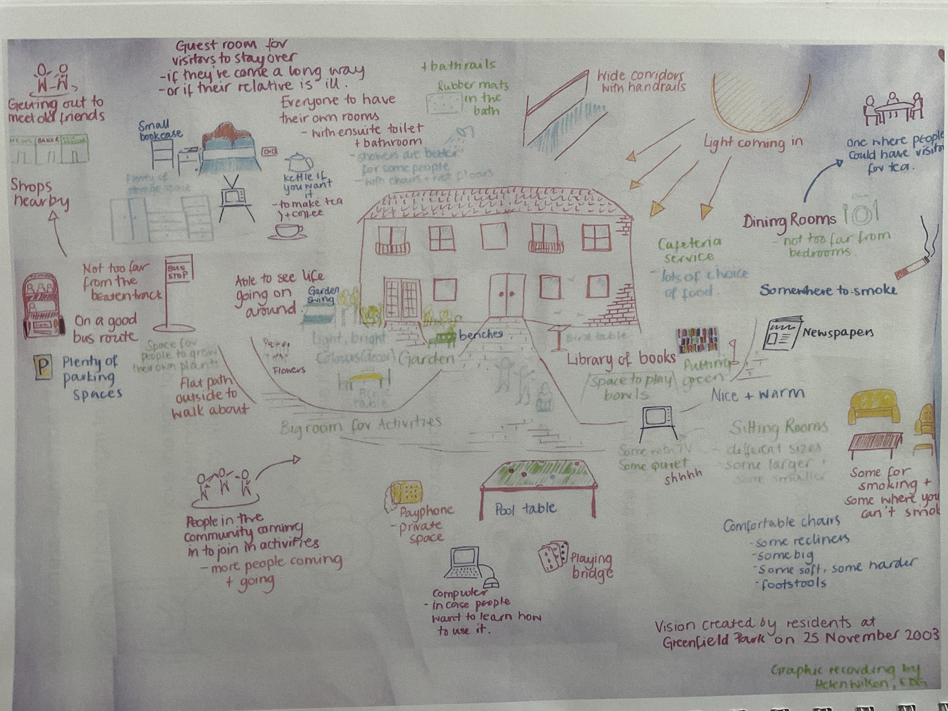
Back in 2003, when I worked at Edinburgh Development Group, I was asked to facilitate a session with a group of residents from three residential care homes in Edinburgh. They were being consulted about a new facility that was to be built. During a one-hour meeting, they created a graphic to help them record their ideas and suggestions. There had been some scepticism beforehand about how this would go - but the graphic helped enormously to engage people, to capture their imagination and hold their attention.
The graphic was originally 2.5 m x 1.5 m in size. It was then digitally photographed (which seemed very hi-tech at the time!) and reduced to A3 size, which was then presented to the architects. The architects honoured many of the residents’ ideas and, although the finished home looked nothing like my drawing, the original graphic was framed and hung in the entrance lobby of the new building to show how the process had shaped the design.
This is the original graphic. I look at it now and cringe slightly as I am hopeful that my drawings have improved in the last 20 years, but I firmly believe that the power of the graphic is in the connection to the process: people feeling motivated and confident to speak; really being heard and being certain that others have listened; creating something collaboratively; knowing that something will happen because the next steps are clear.
Share this post: